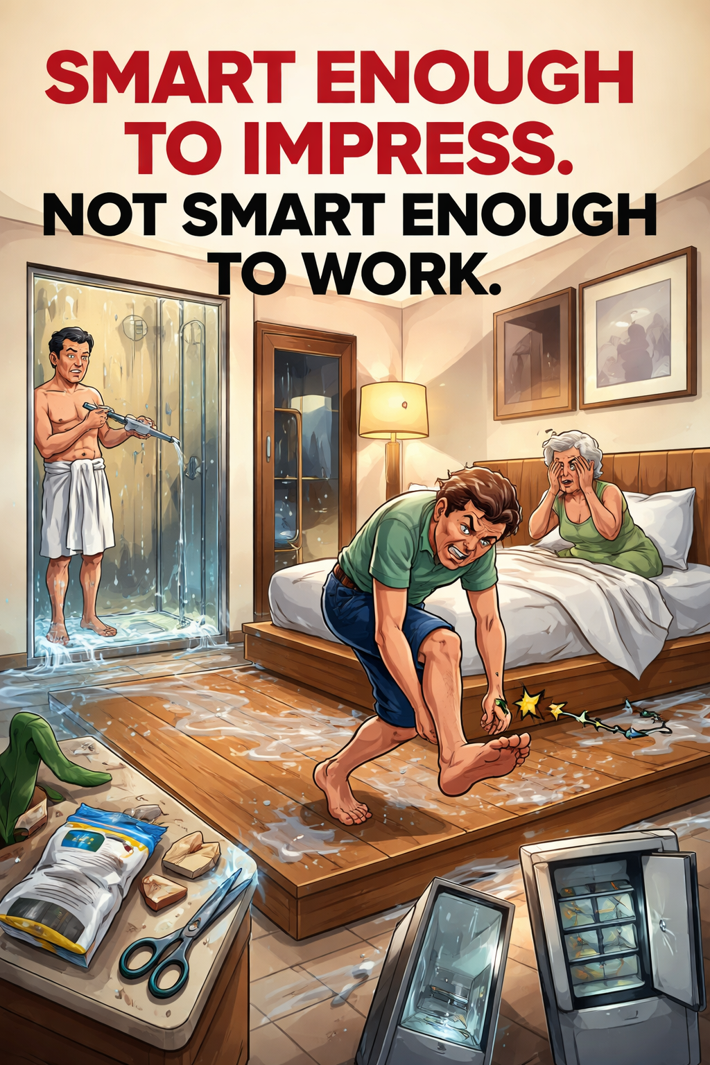
Smart Enough to Impress. Not Smart Enough to Work.
Every time I travel, I’m reminded of a concept I’ve started calling dysfunctional smart design.
This week did not disappoint.
Minimalist, Except for the Water Everywhere
I checked into a beautiful hotel. Clean lines. Warm materials. That kind of quiet, confident design that makes you think: someone really knew what they were doing here.
Then I took a shower.
The shower had no door.
Now, at first glance, this feels intentional. Minimalist. Modern. Almost luxurious. Nothing interrupting the visual flow. Just open space and elegant materials.
Unfortunately, it was also physically impossible to use the shower without flooding the entire wooden floor in the entrance.
Apparently, water, unlike the designer, does not respect clean lines.
Toe: 1 – Design: 0
Later that night, I discovered a bed feature.
Or more specifically, the platform the bed was placed on. A raised wooden frame, about 10 cm high, extending roughly a meter around the bed.
It looked great. Structured. Architectural.
It also meant that getting up in the middle of the night required the spatial awareness of a ninja.
I immediately noticed it and thought: this is dangerous.
The next day, my colleague, staying in a similar room, confirmed the hypothesis. He had met the platform. With his toe. At speed. In the dark.
He spent the day limping.
Easy Open, Impossible Survive
This isn’t just a hotel thing.
You see it everywhere.
Take food packaging.
You know the ones: “easy open”, “resealable”, “smart design”.
Except:
The tab doesn’t peel
The seal tears diagonally into chaos
The zip-lock never works again
So you end up standing in your kitchen, holding something labeled easy open, while reaching for scissors or a knife like it’s a survival situation.
We replaced a simple, reliable action with a clever, unreliable one.
Progress.
Guess the Hinge: A Daily Game of Murphy’s Law
Or the glass fridge doors you see in offices and stores.
Fully transparent. No handles. Ultra-clean.
Also: no indication of which side opens.
So every interaction becomes a small social experiment:
You pick a side
It’s wrong
You awkwardly switch
Every. Single. Time.. And get reminded of the old generation USB sticks that you aways had to turn 180 degrees 3 or 5 times before making it enter the slot.
It’s like a tiny, daily reminder that design can be both confident and completely unhelpful.
Privacy Optional (Unless You’re Not on a Honeymoon)
And then there was another hotel.
This one had taken things a step further.
The shower was a glass cabin. Right in the middle of the bedroom.
Visually? Very “smart”. Very bold. Probably great if you’re on a honeymoon.
Slightly less great if you’re traveling with your mother.
Turns out, privacy is not an outdated feature. It just doesn’t photograph as well.
When ‘Smart’ Replaces ‘Tested’
Individually, these are small things.
But they all share the same pattern:
They look smart
They feel intentional
They signal quality
And then they fail in the most basic moment of use.
Good Design Works When You’re Not Thinking. This Doesn’t.
Which brings me to the real problem.
These aren’t bad ideas.
They’re untested ideas.
Or worse: ideas that were tested, but only under perfect conditions. With full attention. In good lighting. By people who already knew how they worked.
Not by someone:
Tired
Distracted
Barefoot
Traveling with family
Or just trying to open a bag of food without tools
In other words: not by actual humans in real situations.
Somewhere along the way, “smart” replaced “tested”.
The design works beautifully in a presentation.
It looks great in photos.
It communicates taste, intention, and modernity.
But no one seriously asked:
What actually happens when someone uses this?
Good design has a very simple job: It should work when you’re not thinking.
Because most of the time, you’re not.
You’re tired. In a hurry. Half-focused. Maybe getting up in the middle of the night. Maybe trying not to injure yourself. Maybe just hoping for a bit of privacy.
Good design accounts for that.
It protects you from mistakes. It makes the right action obvious. It still works when you’re slightly careless.
Dysfunctional smart design does the opposite.
It assumes:
Full attention
Perfect behavior
A very specific scenario
And when reality inevitably shows up, it breaks.
Or floods your floor. Or injures your toe. Or removes your privacy. Or sends you looking for a knife to open something that promised the opposite.
This isn’t just about hotels or packaging.
It’s the same thing happening in digital products every day.
Features that look elegant but confuse users. Flows that are “streamlined” but remove necessary context. Interfaces that feel clean, but only if you already understand them.
Designed to impress. Not designed to work.
So here’s a simple test:
Can a tired, distracted person use it without thinking?



Leave a Reply